Design is one of the most asked for WordPress Training topics for my WordPress Training Sessions.
With that in mind, there are 10 articles covering key design principles to consider during your web design project. Each can be easily worked into WordPress to enhance your visitor's experience with compelling and individual design.
Second in a set of 10 articles focusing on web design principles to incorporate into your WordPress website design project.
#2 Use negative space
So what does negative space mean in relation to WordPress website design?
Breath, just breath. Giving your content room to breath and giving your visitors the space to view what they need will improve the performance of your WordPress website.
All elements benefit from space
Consider all of the elements on your page. From images to side-bars and graphical elements. Both large and small elements will need their own defined space. This can be a visual spacing rather than a pixel measurement. If it looks balanced, then it is balanced.
Use margins and padding to create a balanced design that has space to breathe and shine.

Chunck content for easy reading
Divide your content into smaller blocks. Smaller paragraphs to increase the visual white space in between each block. This will make your content more readable and easy to scan for those in a hurry.
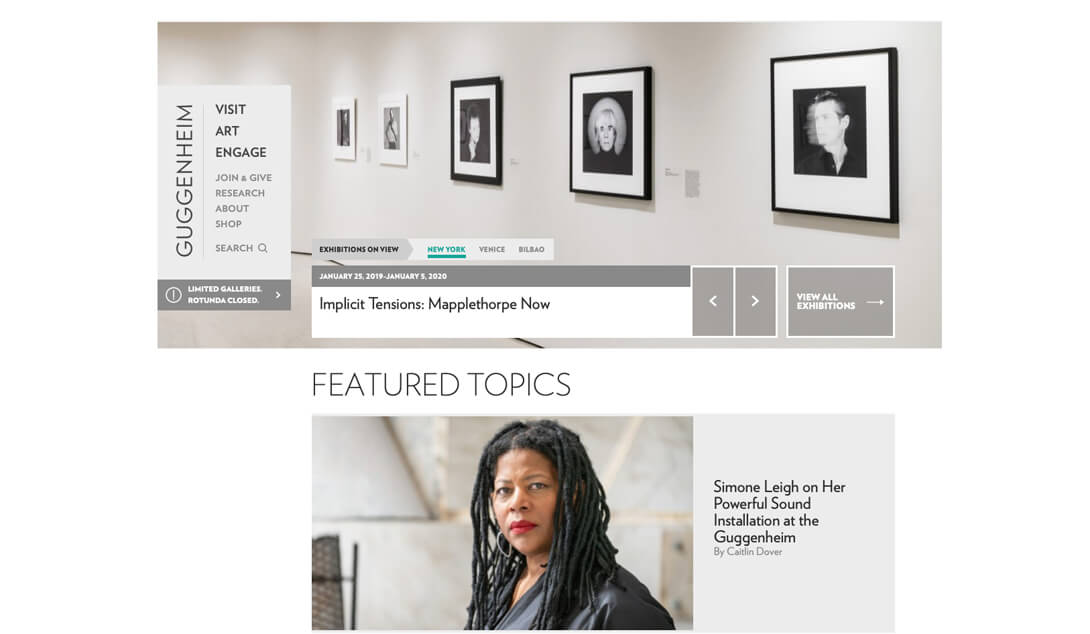
Considered typographical design
Pay attention to line spacing (leading) so that your paragraphs have room to breathe. Smaller fonts need generous line-heights. Headings need space above and below to help them to stand-out.
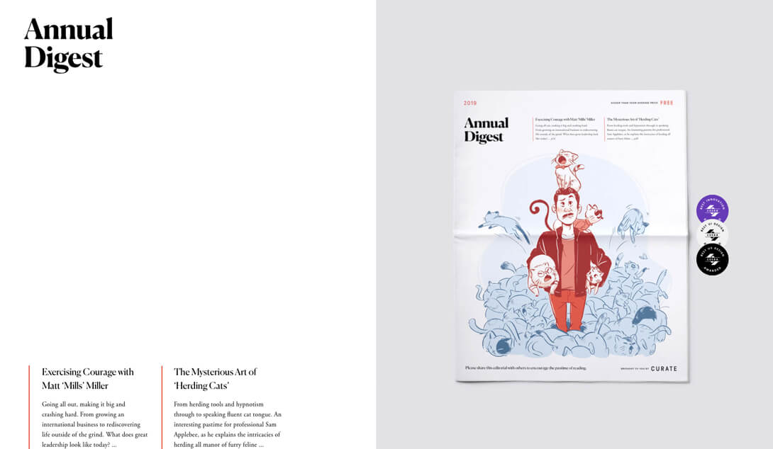
Use colour to create negative space
Thoughtful use of colour can create negative space, white space doesn't have to be white, it's just space. Positive space is the space that contains all the elements on your site, whereas negative space is all of the empty space in between, this can be created with the use of colour to provide breathing space.
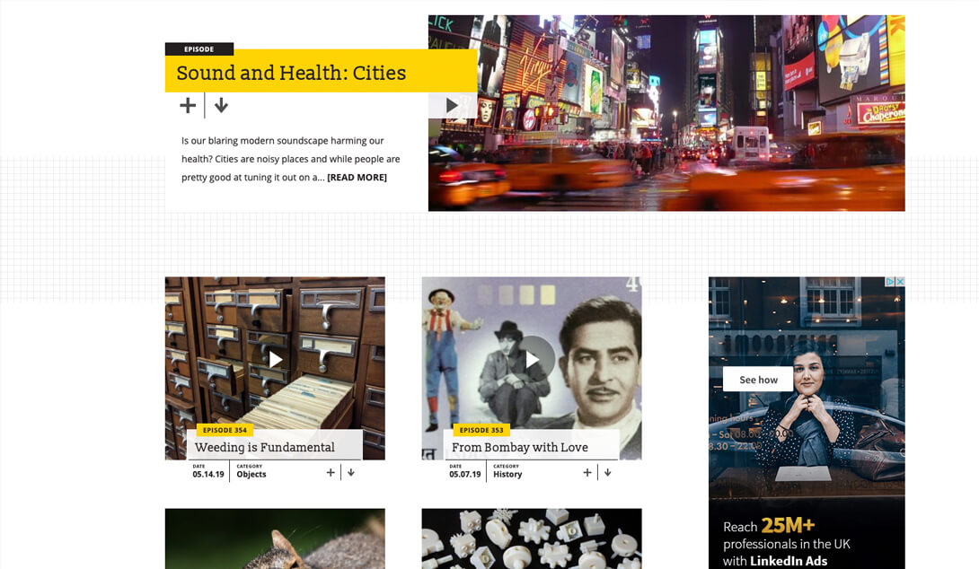
Space on different screen sizes
Check your website pages on a range of screen sizes. Spacing will need to change depending on the space available. Smaller screen sizes may need more space or even sometimes less. Check and adjust for the best user experience.
Design project feedback
“For our luxury retail store, we were consistently impressed with the creativity and design flare provided by Arttia Creative (WP North East). Their ideas and creative marketing are second to none. Always delivered on-time and with visual impact for both on and off-line promotions. If you are looking for creative flare for your business, look no further."
Luxury retailer. HD.
The Takeaway
Space, negative space, white space – provide plenty of room on your WordPress design layouts for your content to breath and convert.
Take a look at each of your WordPress website pages, including your home page and consider space that could be created to emphasise key content. Can you bring attention to important areas with space?
This can also help you to clarify your overall message.
If you need WordPress web design training or someone to design your WordPress pages, get in touch for an initial chat.

Belinda White | WordPress Consultant | WordPress Trainer
Image credits: Unsplash and Adobe Stock
FREE Guide. How to get started with your WordPress Website.
Your FREE PDF guide to get you up and running with your *WordPress website - fast!
*For self-hosted WordPress websites.

